


Attention Sign: Designing Effective Workplace Warnings
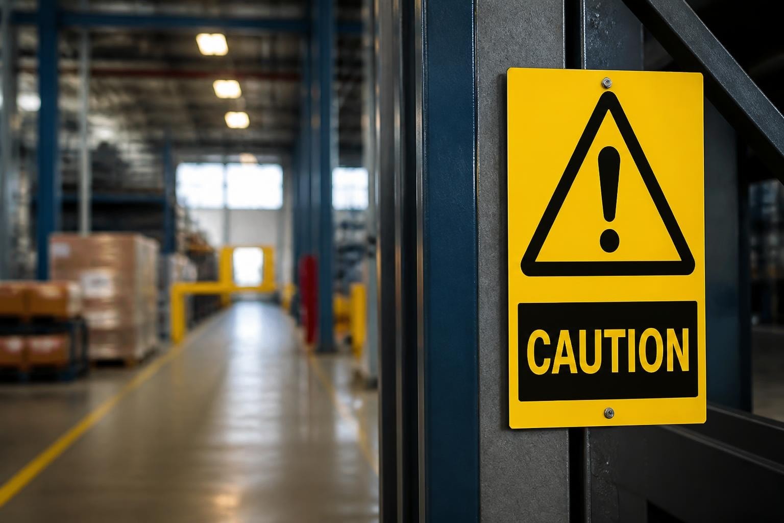
An attention sign serves one critical purpose: to interrupt normal activity and redirect focus toward a potential hazard, mandatory action, or essential information. In workplace environments, manufacturing facilities, public spaces, and roadways, these visual communication tools form the first line of defence against accidents and injuries. The effectiveness of any attention sign depends not only on regulatory compliance but also on human factors such as colour perception, symbol recognition, viewing distance, and environmental context. Understanding the science and best practices behind attention-grabbing signage enables safety managers to create environments where warnings are noticed, understood, and acted upon immediately.
The Psychology Behind Attention Capture
Human visual attention operates through pre-attentive processing, where the brain identifies certain features before conscious thought occurs. Colour contrast, motion, and unexpected patterns trigger automatic neural responses that draw the eye toward specific stimuli. An attention sign leverages these biological mechanisms by using high-contrast colour combinations, distinctive shapes, and universally recognisable symbols.
Research demonstrates that combining pictograms with text significantly improves both attention capture and message comprehension. According to a peer-reviewed study on warning sign effectiveness, image-plus-text warnings outperform text-only formats in both speed of recognition and retention. The human brain processes visual symbols approximately 60,000 times faster than text, making pictograms invaluable for situations requiring immediate response.
Colour Coding Standards
Different colours convey specific meanings across international safety standards. Red indicates prohibition or fire equipment, yellow signals caution or warning, blue denotes mandatory actions, and green represents safe conditions or emergency exits.
| Colour | Primary Meaning | Typical Applications | Psychological Impact |
|---|---|---|---|
| Red | Danger, prohibition, fire | Stop signs, fire extinguishers, emergency stops | High arousal, immediate attention |
| Yellow | Caution, warning | Hazard warnings, trip hazards, chemical alerts | Heightened awareness, processing delay |
| Blue | Mandatory action | PPE requirements, direction instructions | Compliance association, lower urgency |
| Green | Safe condition, information | Emergency exits, first aid, assembly points | Calm, safety reassurance |
This standardisation allows workers and visitors to rapidly categorise information without reading detailed text. OSHA regulations specify the exact colour schemes and header words (Danger, Warning, Caution, Notice) required for different hazard levels in workplace environments.

Design Elements That Command Attention
Beyond colour, several design variables determine whether an attention sign successfully interrupts normal visual scanning patterns. Size, shape, border treatment, typography, and symbol complexity all contribute to conspicuity and legibility.
Shape Recognition and Meaning
Traffic and safety signage employ distinctive shapes to communicate information before viewers can read text or interpret symbols. Octagonal shapes universally signal stop commands, triangular signs indicate warnings, circular formats denote prohibitions or mandatory actions, and rectangular signs provide general information.
The Manual on Uniform Traffic Control Devices provides comprehensive federal guidance on how shape conventions ensure rapid recognition in transportation settings. These principles extend to workplace safety, where consistent shape usage across warning signs and prohibitory signs creates predictable visual patterns.
Typography and Readability
Font selection dramatically affects readability distance and comprehension speed. Sans-serif typefaces with consistent stroke width perform best for attention signs, as ornamental or serif fonts reduce legibility under poor lighting or at angles.
Key typography principles include:
- Letter height minimum of 25mm for every 7.6 metres of viewing distance
- High x-height fonts that maximise the proportion of lowercase letters
- Bold or medium weights rather than light or condensed variants
- Sentence case or title case instead of all capitals for extended text
- Sufficient white space between letters, words, and lines
Research on laboratory warning sign design confirms that viewers scan pictograms first, then read header words, and finally process detailed text. An effective attention sign therefore places the most critical information in the visual hierarchy's primary position.
Strategic Placement and Environmental Context
Even perfectly designed attention signs fail if positioned where sightlines are obstructed, lighting is inadequate, or visual clutter overwhelms the message. Placement strategy must account for approach angles, typical viewing distances, ambient lighting conditions, and competing visual stimuli.
Mounting Height and Viewing Angles
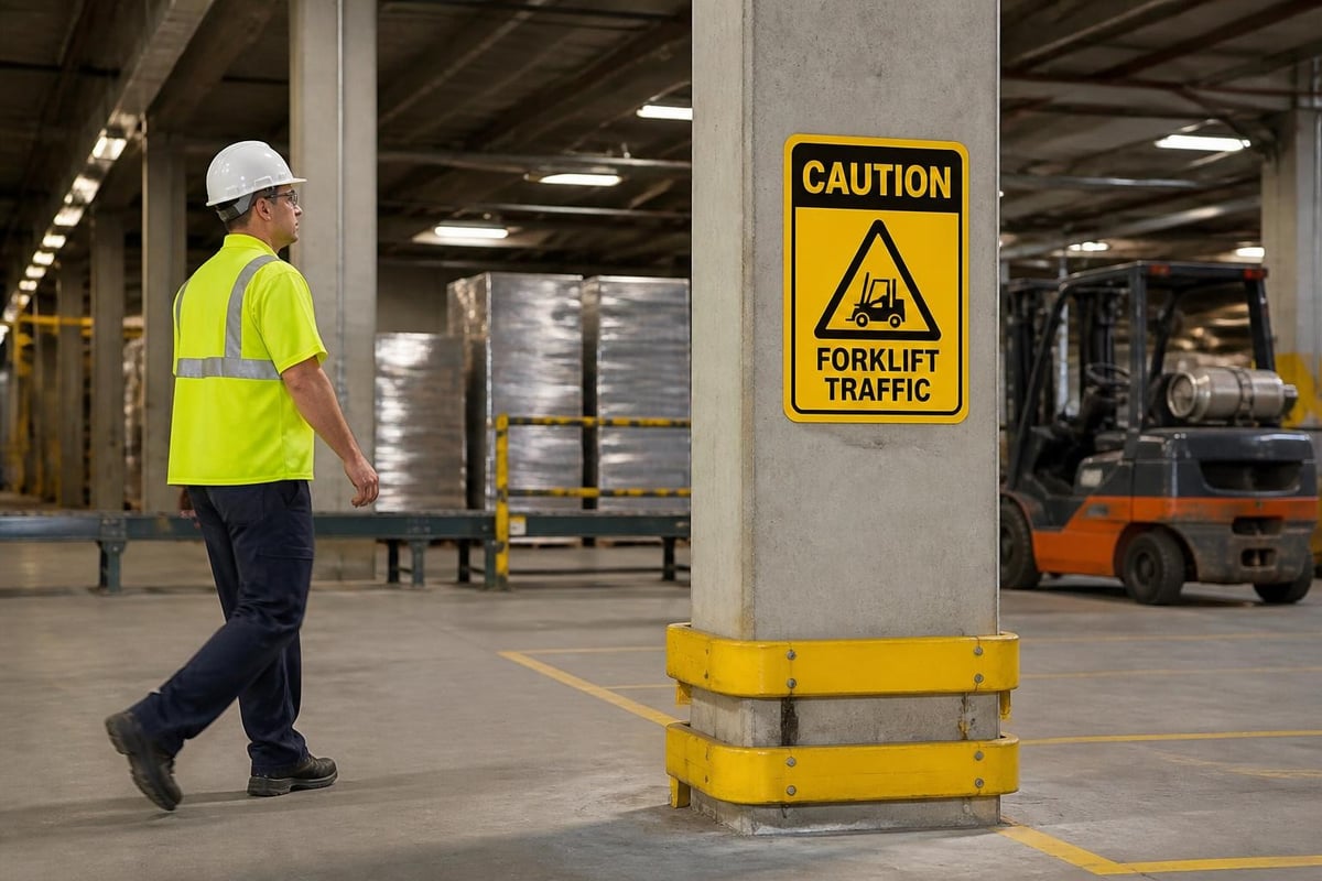
Standard mounting positions place signs at eye level (approximately 1.5 to 1.8 metres from floor level) for standing adults. However, context determines optimal placement. Overhead-mounted signs work well in warehouses with high ceilings and forklift traffic, whilst low-mounted signs suit areas where workers crouch or kneel.
Placement considerations for maximum visibility:
- Position signs perpendicular to primary traffic flow
- Install at decision points before hazards, not alongside them
- Ensure adequate illumination through natural light, ambient lighting, or self-luminous materials
- Avoid mounting near competing visual information or busy backgrounds
- Duplicate signs when approach paths vary (corners, intersections, multiple entries)
The National Academies' human factors guidance emphasises how consistency in placement creates expectation patterns that accelerate recognition. When signs appear in predictable locations, viewers develop automatic scanning behaviours that improve detection rates.
Environmental Hazards and Material Selection
Industrial environments present unique challenges including chemical exposure, extreme temperatures, moisture, and impact risks. An attention sign in a chemical processing facility requires different materials than one in an office corridor.
| Environment | Recommended Materials | Durability Considerations |
|---|---|---|
| Outdoor/UV exposure | Aluminium, reflective sheeting, UV-stable plastics | Fade resistance, weather sealing |
| Chemical/corrosive | Stainless steel, chemical-resistant laminates | Solvent resistance, easy decontamination |
| Low-light/emergency | Photoluminescent materials, retroreflective films | Charge retention, reflective performance |
| High-traffic/impact | Heavy-gauge metals, reinforced plastics | Impact resistance, edge protection |
Photoluminescent signs offer particular advantages in emergency situations where power failures eliminate normal lighting. These materials absorb ambient light and emit a visible glow for hours, ensuring critical fire fighting signs and exit markers remain visible during evacuations.
Symbol Selection and Universal Comprehension
Pictograms transcend language barriers, making them essential for diverse workforces and international operations. However, not all symbols achieve universal recognition. Cultural differences, educational backgrounds, and exposure history influence interpretation accuracy.
Designing for Diverse Audiences
A machine-learning study on safety sign comprehension identified three critical attributes that predict understanding across varied populations: familiarity (previous exposure), simplicity (minimal visual complexity), and meaningfulness (logical connection between symbol and concept).
Standardised pictograms from ISO 7010 and ANSI Z535 series provide internationally tested symbols with documented comprehension rates. These standards undergo rigorous validation to ensure at least 67% of naive viewers (those without prior training) correctly interpret the intended message.
Principles for selecting effective pictograms:
- Prioritise ISO-standardised symbols over proprietary designs
- Test comprehension with representative user populations
- Avoid abstract concepts that require cultural knowledge
- Use concrete, action-oriented imagery rather than metaphorical representations
- Combine symbols with supplementary text for technical or complex warnings
For specialised industries, custom symbols may prove necessary. In such cases, comprehensive training programmes must accompany installation, and text explanations should appear prominently on the attention sign itself.
Multi-Modal Communication Strategies
The most effective safety communication systems employ redundancy across multiple sensory channels. Visual signs combine with audible alarms, tactile warnings (textured surfaces, vibrating equipment), and procedural controls (lockout/tagout systems, access restrictions).
This layered approach acknowledges that attention varies throughout work shifts. Fatigue, distraction, sensory impairment, and cognitive load all reduce the probability that any single attention sign will successfully interrupt task focus. Redundant warning systems ensure critical messages reach workers regardless of temporary attention lapses.
Regulatory Compliance and Industry Standards
Safety signage requirements vary by jurisdiction, industry sector, and specific workplace hazards. Compliance with applicable regulations protects organisations from liability whilst ensuring baseline safety performance. However, regulatory minimums rarely represent best practice, and leading organisations exceed mandatory requirements.
International Standards Framework
Multiple regulatory bodies publish signage standards, sometimes with conflicting requirements. OSHA governs workplace safety in the United States, whilst equivalent bodies operate in other regions. ISO 7010 provides international standardisation, and industry-specific regulations address unique hazards in mining, construction, maritime, and other sectors.
OSHA's sign and tag specifications mandate specific header words and colour combinations for different hazard severity levels. Danger signs (red, black, and white) indicate immediate hazards likely to cause death or serious injury. Warning signs (orange and black) signal potential serious injuries. Caution signs (yellow and black) address less severe risks.
Understanding these distinctions ensures appropriate attention sign selection. Overusing the highest severity category (Danger) creates alarm fatigue, where workers become desensitised to warnings. Conversely, underrepresenting serious hazards with inadequate signage exposes organisations to preventable incidents.
Audit and Maintenance Requirements
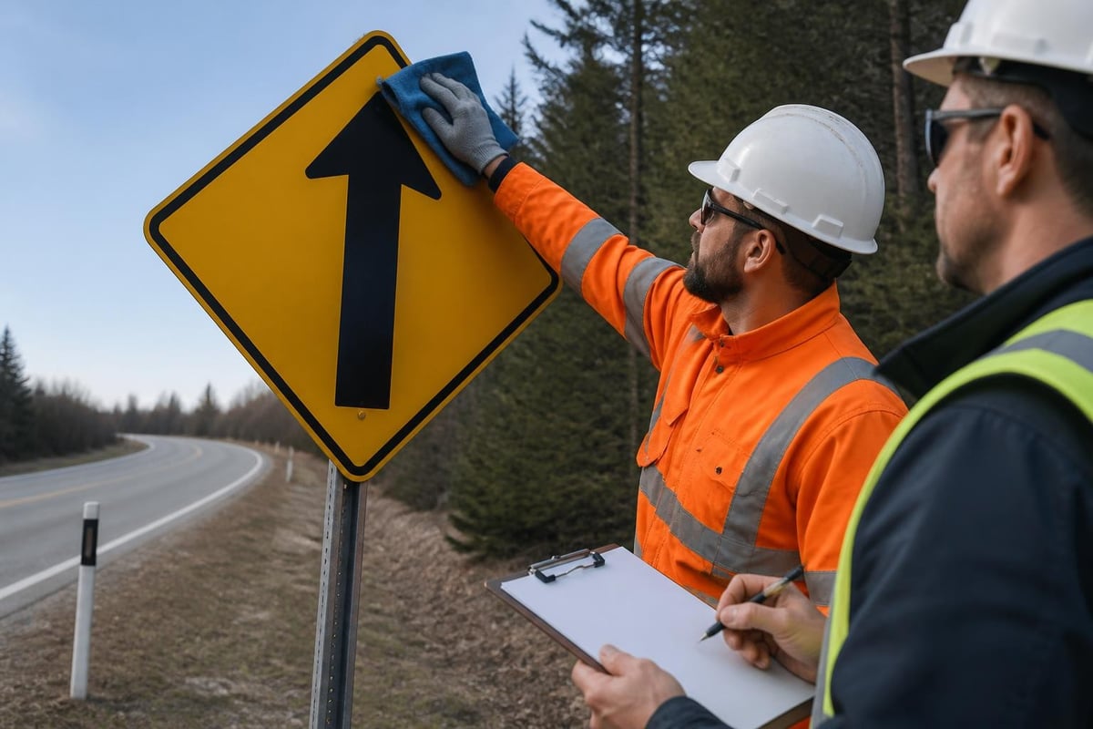
Installing compliant signs represents only the beginning of an effective programme. Regular audits verify that signs remain visible, legible, accurate, and relevant as workplace conditions change.
Essential maintenance activities include:
- Quarterly inspections for damage, fading, or obstruction
- Immediate replacement of damaged or illegible signs
- Updates when processes, equipment, or hazards change
- Verification that new employees receive orientation on sign meanings
- Documentation of inspection findings and corrective actions
Neglected signs lose effectiveness rapidly. Faded colours reduce contrast and attention capture, whilst accumulated dirt or physical damage signals organisational indifference to safety. Workers unconsciously interpret maintenance standards as indicators of leadership's genuine commitment to protection.
Integration With Comprehensive Safety Systems
An attention sign functions most effectively as one component within holistic safety management systems. Signage alone cannot prevent all incidents, particularly when organisational culture, training, equipment, and procedures contain deficiencies.
Complementary Safety Elements
Complete workplace safety requires integration across multiple domains. Personal protective equipment addresses individual exposure risks, whilst mandatory signs communicate required PPE in specific zones. Engineering controls eliminate hazards at the source, and administrative controls limit exposure duration or intensity.
Effective attention signs direct workers toward these complementary protections. A chemical storage area requires warning signs identifying specific substances, mandatory signs specifying required PPE, emergency shower and eyewash locations, and spill response procedures.
Training and Behavioral Reinforcement
Signage effectiveness multiplies when combined with comprehensive training programmes. Workers who understand the rationale behind specific warnings demonstrate higher compliance rates than those who simply see signs as bureaucratic requirements.
Training should address:
- The specific hazards each attention sign represents
- Consequences of ignoring warnings (real incident examples)
- Proper responses to different sign categories
- Reporting procedures for missing, damaged, or unclear signs
- Cultural and language considerations for diverse teams
Behavioural safety observations provide ongoing reinforcement. When supervisors and peers consistently respond to signage and model appropriate behaviours, safety culture strengthens. Conversely, leadership that ignores posted warnings signals that compliance is optional, rapidly eroding the entire safety system's credibility.
Technology-Enhanced Attention Systems
Digital technologies expand capabilities beyond static printed signs. Electronic displays, augmented reality, and sensor-triggered warnings create dynamic attention systems responsive to changing conditions.
Dynamic Digital Signage
LED displays and electronic message boards allow real-time updates based on current hazards, weather conditions, or operational status. Construction sites use variable message signs to communicate daily hazards, whilst manufacturing facilities display production metrics alongside safety performance.
Advantages of digital attention signs include:
- Instant updates without physical replacement
- Attention-grabbing animation and movement
- Scheduled messaging for different shifts or operations
- Integration with monitoring systems for automatic alerts
- Multi-language capability with simple software changes
However, digital systems introduce dependencies on power, network connectivity, and software reliability. Critical life-safety information should always maintain static backup signage to ensure visibility during system failures.
Sensor-Integrated Warning Systems
Advanced facilities deploy sensor networks that trigger attention signs when specific conditions arise. Gas detectors activate warning beacons when concentrations exceed safe thresholds, temperature monitors highlight overheating equipment, and proximity sensors alert workers entering restricted zones.
These intelligent systems overcome the limitation that static signs must anticipate all possible hazard scenarios. Real-time responsiveness ensures warnings appear precisely when needed, reducing both false alarms (which create fatigue) and missed warnings (which allow exposures).
Measuring Effectiveness and Continuous Improvement
Organisations committed to safety excellence measure attention sign performance and refine programmes based on evidence. Multiple metrics assess whether signage achieves intended outcomes.
Quantitative Performance Indicators
Incident data provides the ultimate measure of safety programme effectiveness. Tracking injuries, near-misses, and property damage by location reveals whether adequate attention signs exist and whether workers heed posted warnings.
| Metric | Data Source | Target Benchmark | Analysis Frequency |
|---|---|---|---|
| Incident rate per signed hazard | Safety reports, hazard register | Zero preventable incidents | Monthly |
| Sign comprehension scores | Employee assessments, audits | >90% correct interpretation | Quarterly |
| Visibility compliance | Inspection checklists | 100% unobstructed, legible | Weekly |
| Response time to maintenance needs | Work order system | <48 hours for critical signs | Continuous |
Comprehension testing deserves particular emphasis. Surveying workers about sign meanings reveals gaps between intended messages and actual understanding. Low comprehension scores indicate needs for redesign, additional training, or alternative communication methods.
Qualitative Feedback Mechanisms
Frontline workers possess invaluable insights about signage effectiveness. Regular safety committee meetings, anonymous reporting systems, and walkthrough observations capture perspectives that data alone misses.
Questions to explore include:
- Which signs do workers find most helpful or most confusing?
- Where do workers wish additional attention signs existed?
- What distractions or obstructions interfere with sign visibility?
- How do contractors and visitors respond to site signage?
- What cultural or language barriers affect comprehension?
Acting on this feedback demonstrates leadership commitment whilst continuously improving programme effectiveness. Workers who see their suggestions implemented become partners in safety rather than passive recipients of top-down mandates.
Emerging Trends and Future Developments
Safety signage continues evolving as research reveals new insights about human perception, materials science advances, and digital technologies mature. Forward-thinking organisations monitor these developments to maintain cutting-edge programmes.
Personalised and Context-Aware Systems
Wearable technology and location tracking enable personalised safety alerts delivered directly to individuals based on their specific location, role, and authorisations. Smart helmets with heads-up displays can overlay virtual attention signs in the wearer's field of view, whilst smartphone apps provide detailed hazard information when workers approach specific areas.
These systems complement rather than replace physical signage, offering additional layers of protection for high-risk operations. However, privacy concerns, technology costs, and the need for continuous power limit current widespread adoption.
Sustainable and Adaptive Materials
Environmental consciousness drives demand for recyclable sign materials, low-VOC inks, and manufacturing processes with reduced carbon footprints. Simultaneously, smart materials that change appearance based on temperature, light, or chemical exposure create adaptive attention signs that highlight active hazards whilst remaining neutral under safe conditions.
Thermochromic inks that shift colour at elevated temperatures could warn of hot surfaces more effectively than static signs. Photochromic materials that darken under UV exposure could indicate outdoor radiation risks. These innovations remain largely experimental in 2026 but show promise for future applications.
Effective attention signs combine regulatory compliance, evidence-based design, strategic placement, and integration within comprehensive safety systems to protect workers and visitors from preventable harm. By applying principles of colour psychology, symbol recognition, and human factors engineering, organisations create visual communication that captures attention and prompts appropriate responses. Whether you need compliant safety signs for new facilities, replacement signs for ageing infrastructure, or specialised solutions for unique hazards, SafetySignsForSale provides the expertise and product range to meet your requirements across industrial, commercial, and public sector applications.